
Are you intimidated by colour? Do you open up a design application and struggle to determine what works well? By learning some fundamental principles of working with colour, your confidence will soar.
The basics
Colour is measured in hue, which is typically referred to as the name we call the colour, e.g. the blue background of a website.
Value, which is called lightness or tone, is referring to the range of light in an image.
To apply colour effectively in a design, it’s important to become familiar with the colour wheel and colour harmony.
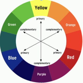
The Colour Wheel
The artist colour wheel has yellow, orange, red, violet, blue and green.
The expanded version includes hues between those.
Improper use of colour can easily overwhelm your users. Using the colour wheel is one way to figure out colour harmony. Colours opposite on the wheel are called complementary colours, and those next to each other are analogous colours.
Monochromatic colour schemes are made up of different tones, shades and tints within a specific hue.
Exercise #10 Pick three colours: The 60–30–10 Rule
Generally speaking, most good colour palettes begin with three colours. Effectively, this breaks down to one dominant colour – used for around 60%of the design, a secondary colour is applied to 30% of the design and an accent colour at 10%.
The meaning of colour
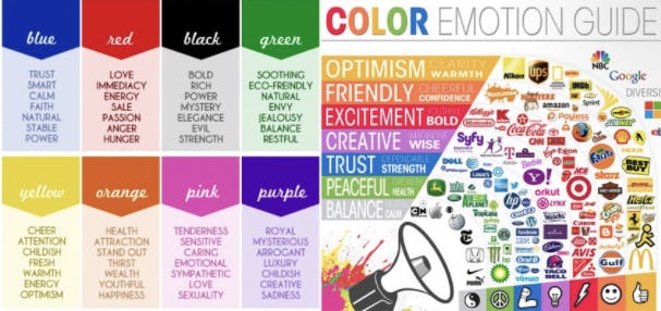
Colours can be very powerful in influencing the way we feel. There can be both positive and negative associations with every colour.
Positive Colour Associations
Red: Love, urgency, youth
Orange: Energy, ambition, enthusiasm
Yellow: Cheer, joy, energy
Green: Growth, nature, luck
Blue: Peace, trust, security
Purple: Wisdom, respect, wealth
Negative Colour Associations
Red: Warning, war, annoyance
Orange: Anxiety, aggression, nervousness
Yellow: Insecurity, distraction, panic
Green: Envy, apprehension, uncertainty
Blue: Grief, remorse, dispassion
Purple: Boredom, loathing, disgust
Creating your own palette
There are many ways to set up a colour scheme in a design.
● A great place to start is with a photo. Adobe has created a great free resource called Adobe Color where you can upload a photo you’re inspired by to extract its colour palette.
● Coolors: This app automatically generates colour schemes for you to browse. It also has a colour blindness toggle so you can view colours from an accessibility standpoint.
● Colormind: This deep learning tool picks out colour palettes from photos, movies and art to create palettes that you can use. New colour combinations are uploaded daily.
● Canva Color Palette Generator: Designed to pull colours from images, this tool will provide you with a palette that matches your favourite picture.
● Paletton: This tool uses a colour wheel visually and allows you to choose the type of palette you want. You can also export and share colour combinations.
● COLOURlovers - Create a Palette: With several options to get started, just fill out the form and mix and match your favourite hues with a list of HEX, RGB and HSV values. You can save palettes for later and even match from photos.
Colour is one of the most powerful tools in a designer’s toolkit. But like any other tool, it should be used with purpose. We hope these simple guidelines will help you work with confidence.
Top Ten Tips of Engaging Content, brought to you by TEN ALPHAS and supported by City of Sydney